Wednesday, November 22, 2023

GIS and Thematic mapping: Rise of Digital Cartography

Wednesday, November 22, 2023 0 Comments


A thematic map is a type of map that focuses on a specific theme or topic, presenting spatial patterns and relationships of geographic data related to that theme. Unlike general reference maps, which provide a broad overview of geographic features like rivers, mountains, and political boundaries, thematic maps emphasise a particular subject matter

Thematic maps are designed to convey information about the structure of distribution, variation, and spatial patterns of a specific attribute or phenomenon. 

Thematic maps can represent a wide range of themes, both physical and cultural features, like population, settlement, resources, socio-economic attributes, transportation and trade, land use and land cover including topographical attributes, features of geological, climatic and vegetation etc.  it may be quantitative, qualitative or semi-quantitative. 

It uses various cartographic techniques to visually communicate information. Common methods include colour-coding, symbols, isolines (contour lines), and choropleth maps (shaded or patterned areas). The choice of symbology depends on the nature of the data being represented and the message the map aims to convey.

Geographic Information Systems (GIS) play a crucial role in thematic mapping, providing a powerful tool for visualising and analysing spatial data in a variety of fields. GIS helps in handling large amounts of spatial data and preparing digital thematic layers which is used for preparing thematic maps and multiple layer spatial analysis for spatial decision making. Present day digital cartography is purely based on GIS. Researchers, planners, government officials are now  using GIS for all these activities including production desired and required thematic maps. 

Advantages of GIS in thematic mapping:

  1. Presenting a large amount of information quickly has become easier in a very short time,

  2. The complexity of thematic map production has been reduced,

  3. There is much more flexibility in using colours because it is possible to use many shades of the same colour. As a result, the acceptability of subject-based thematic maps has increased significantly,

  4. In the field of subject-based thematic mapping, mathematical methods of various categories can be used in the categories in which the category is divided, so personal preferences have been minimised,

  5. The use of modern spatial statistics is now possible in the field of subject-based thematic mapping, allowing for scientifically informed categorization,

  6. Many innovations have been introduced in the design of maps, making subject-based thematic maps much more attractive,

  7. The use of spatial statistics in modern demographic studies is now possible in the field of subject-based thematic mapping, allowing for scientifically informed categorization.

Examples of applications of GIS in thematic mapping:

Here are some examples, exploring how GIS enhances the representation and analysis of diverse spatial data:

  1. Environmental Mapping:

GIS allows for the integration of environmental data, such as air and water quality measurements, satellite imagery, and ecological surveys. By mapping these variables, environmental scientists can visualise the distribution of pollutants, identify environmentally sensitive areas, and monitor changes over time.

  1. Urban and regional Planning:

In urban planning, GIS is used to create thematic maps illustrating land use patterns. For example, zoning maps can show areas designated for residential, commercial, or industrial use. GIS also helps analyse infrastructure distribution, traffic patterns, and population density, aiding planners in making informed decisions about city development and resource allocation of the city and surrounding countrysides. 

  1. Health Mapping:

Thematic mapping in GIS is crucial for tracking the spread of diseases. Health professionals use GIS to map the locations of reported cases, identify clusters, and assess the effectiveness of intervention strategies. GIS also plays a role in resource allocation, helping health organisations direct personnel and supplies to areas in need.

  1. Geological Mapping:

GIS is extensively used in geology to create geological maps that represent various features of the Earth's crust. These maps may include information on rock types, fault lines, and mineral deposits. Geologists rely on GIS to identify areas with high mineral potential, assess geological hazards, and plan for sustainable land use.

  1. Demographic Mapping:

Thematic maps in GIS are employed to represent demographic data such as population distribution, age structures, and socio-economic indicators. Policymakers use these maps to understand population trends, plan for public services, and address social inequalities.

  1. Climatic Mapping:

GIS facilitates the creation of climatic maps by integrating data from weather stations, satellites, and climate models. These maps can show temperature variations, precipitation patterns, and climate zones. Climate researchers use GIS to analyse changes over time, study the impacts of climate change, and plan for adaptation strategies.

  1. Transportation Planning:

GIS is a valuable tool for transportation planning, providing insights into traffic patterns, road networks, and public transportation systems. Planners use GIS to identify areas with high congestion, plan for new transportation infrastructure, and optimise routes for logistics and emergency services.

  1. Land Use Planning:

Thematic mapping in GIS is fundamental to land use planning. By mapping land cover, zoning regulations, and development plans, GIS helps planners make informed decisions about where to allocate resources, where to encourage or restrict development, and how to balance urbanisation with environmental conservation.

  1. Agricultural Mapping:

GIS is employed in agriculture to map crop types, soil characteristics, and irrigation patterns. Farmers and agricultural experts use this information to optimise crop yields, manage resources efficiently, and monitor the health of crops. Precision agriculture, which relies on GIS, allows for targeted application of resources such as water and fertilisers.

  1. Natural Resource Management:

GIS is crucial for mapping and managing natural resources. Forestry departments use GIS to map forest cover, monitor deforestation, and plan for sustainable logging. Water resource managers use GIS to map watersheds, monitor water quality, and plan for water conservation measures. GIS also aids in mapping and managing mineral resources, helping to balance extraction with environmental conservation.

In essence, GIS enhances thematic mapping by providing a spatial framework for understanding complex relationships within and between different thematic layers. The ability to visualise, analyse, and interpret spatial data is a powerful asset across various domains, contributing to informed decision-making and sustainable resource management.

Saturday, September 23, 2023

Interpretation of SOI topographical map: Identification and Marginal Information

Saturday, September 23, 2023 0 Comments

 Interpretation of the survey of India (SOI) topographical map requires careful study of the map and the conventional symbols

Quality of the interpretation depends on the theoretical knowledge of the geographic features (topography and landforms, Jane, age, System, transport and communication and settlement etc) and their inter relationship and a prior knowledge about the area under study. 

Before proceeding into the interpretation of the map, it is necessary to identify the topographical Map by its marginal information. 

Marginal information of survey of India topographical maps: 


1. Administrative identity: Each SOI topographical Map represents a portion of an administrative area (District of a State) and the  name of the district and state is mentioned in the top of the map. 
Name of the state is written in the middle part of the top margin of the map and the district name is written on the top left margin of the Map (see below image)

2. Index number/ reference number/ sheet number: As the topographical maps are drawn systematically for the entire country (here India), which is subdivided into different spatial units at different levels and maps are drawn for each smallest spatial units for the entire country. Thus each map contains a unique identification number which is known as index number/ reference number or sheet number of the Map. 

3. Map legends or Keys: Map legends or keys for the conventional symbols are the most important part of any map and for topographical map. It is even more important because identification of the geographic features and their characteristics entirely depends on the conventional symbols and their meanings.  
In the survey of India topical maps, the conventional symbols are displayed in the left and right part of the bottom margin. 
4. Scale

4. Scale: without a scale, a map cannot be drawn because the portion of the actual earth’s surface has been reduced to a scale and is represented on a map by systematic transformation through my projection. Scale represents the ratio of the Map distance and corresponding ground distance. 
In the topographical Map, the scale is represented in all the three forms of scale i. e. Statement scale, Representative fraction and graphical scale and located at the middle of the bottom margin of the Map. 


5. Sheet index and 6. Administrative index: As it has already been mentioned that the topographical map has been drawn in a systematic way for the entire region and therefore for a particular area several maps are produced each of which has been drawn with unique identification number. 
Thus in the topographical Map, a sheet index has been provided for reference to map readers to provide the additional  information about the other  topographical maps surrounding the concerned map under study. 
In addition to the sheet index, administrative index represents the portion of the area of a particular administrative division, represented in the concern Topographical Map. 

7. Coordinates: Each topographical Map is drawn with the parallels of latitude and meridians is of longitude in order to provide exact coordinate values (positional advantage) to the Map readers. 


Wednesday, September 20, 2023

Functional classification of Indian cities by Ashok Mitra

Wednesday, September 20, 2023 0 Comments

Ashok Mitra introduced a functional classification system for towns in India, drawing upon industrial categories from the 1971 Census of India. At that time, he held the position of Registrar General of the Census of India. Like Harris and Nelson, Mitra categorised Indian towns and cities based on their economic functions, and his approach is considered highly suitable for the Indian context due to its flexibility. He gauged the dominant economic function of a town by examining the proportion of its workforce engaged in industrial activities.

The 1971 Census of India identified nine major industries, classified as follows:

I. Cultivators

II. Agricultural Laborers

III. Livestock, fishing, forestry, hunting, plantation, and allied activities

IV. Mining and Quarrying

V. Manufacturing, including both household and non-household manufacturing

VI. Construction

VII. Trade and Commerce

VIII. Transport, Storage, and Communication

IX. Other Services

These categories were based on the Indian Standard Industrial Classification. However, Mitra excluded agricultural activities from his classification, deeming them primarily rural in nature. Consequently, his final classification of towns encompassed categories III through IX.


Mitra's Functional Classification Criteria for Towns:

According to Ashok Mitra, a town's character is defined by the dominance of its three major economic activities. He established the following criteria for classifying towns into the above three categories:

Manufacturing Town:

Industries falling under III, IV, V, and VI are part of the manufacturing sector, involving processes that add value to raw materials. A town is classified as a manufacturing town when the percentage of workers engaged in manufacturing activities surpasses that in other economic sectors. In such towns, manufacturing is the primary economic function.

Trade & Transport Town:

Economic activities categorised as VII and VIII are part of the trade and transport sector, playing a crucial role in the movement of raw materials, goods, labour, and services. A town qualifies as a trade and transport town when the proportion of workers in trade and transport activities exceeds that in other economic sectors. In such towns, trade and transport constitute the primary economic function.

Service Towns:

Economic activities designated as IX belong to the service sector, offering various skills, knowledge, and assistance to other sectors for their smooth operation. A town is categorised as a service town when the percentage of workers engaged in service activities surpasses that in other economic sectors.


Degree of specialisation

Ashok Mitra's perspective emphasised the multifunctionality of towns, recognizing that the level of specialisation or the predominant function could differ from one town to another. As a result, he argued against categorising each manufacturing or service town into a single category for the purpose of crafting development policies. 

Instead, Mitra employed a Ternary Diagram to assess the extent of specialisation in a town's economic function. Once the broad functional classification of a particular town had been determined, the proportion of the town's most dominant economic function was plotted on the ternary diagram to gauge the degree of specialisation.


The term "Ternary diagram" (see figure) refers to a diagram that illustrates the percentage or proportion of three indicators along the three sides of a triangle. The percentage gradually increases from the midpoints of the sides (A, C, E) of the triangle toward the vertices (B, D, F). 

In Ashok Mitra's functional classification of towns, this ternary diagram displays the percentage of workers engaged in manufacturing, trade & transport, and services along its three sides.


In this diagram, the blue, red, and yellow lines represent the percentages of workers. These percentages start at zero along the midpoints of the triangle at points A, C, and E and increase towards points B, D, and F. For instance, in the case of services, the percentage of workers begins at zero at point E and rises towards F, where it reaches 100%.

Furthermore, a smaller black triangle indicates the 50 percent threshold. When the line EF crosses this smaller triangle, it signifies that the percentage of workers in the service sector exceeds 50%.


Categories of Specialisation:

Mitra incorporated three circles drawn from the centre of the triangle, proportionally, to signify varying degrees of specialisation. When the percentage of workers in a dominant function is plotted on the ternary diagram, it results in the following categories of specialisation:


Diversified Towns: The centre point of the triangle corresponds to 35 percent. Any point falling within the purple circle denotes a diversification of economic activities.

Moderately Specialized: Towns falling between the purple and black circles indicate a moderate functional predominance.

Highly Specialised: Towns located between the black and green circle points suggest a high degree of functional predominance.

Very Highly Specialised: Finally, points located outside the green circle indicate a very high degree of specialisation.

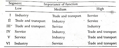
Here is the list of the six zones of the triangle outside the 50% circle and the dominance of workers:

Relevance and Conclusion:

Ashok Mitra devised a highly pragmatic classification system for cities and towns in India. He recognized that Indian cities are multifunctional and cannot be neatly pigeonholed into specific categories. Therefore, he categorised them based on their most dominant economic function. Although there were no rigid criteria for qualifying for a particular functional category, this classification method organises broad categories into classes based on the degree of specialisation. Nevertheless, it does not account for the agricultural activities present in Indian cities, such as horticulture on the floodplains of the Yamuna River in Delhi. Despite this, the classification remains remarkably flexible and objective.


See video: 


Thursday, August 31, 2023

Normalisation of data

Thursday, August 31, 2023 0 Comments

 Normalisation is a data preprocessing technique used in statistics, to scale and transform numerical data of different units and measurement scales to a common measurement scale. This helps in improving the performance and convergence of certain algorithms that are sensitive to the scale of measurement of input variables. 

Here are some common methods:


1. Ratio of Mean: Normalisation by the ratio of mean is a technique used to scale data by dividing each data point by the mean of the dataset. This method ensures that the mean of the normalised data becomes 1. It's a simple approach and can be useful in situations where you want to emphasise the relative position of each data point with respect to the mean. 


Formula


Example:

Suppose you have a dataset representing the monthly sales figures (in thousands of dollars) for a retail store over a year:

X=[15,20,25,18,30,22,28,16,32,26,19,23]

Calculate the mean of the original dataset:

Normalise each data point by dividing it by the mean:

Calculated values for normalised data:


2. Min-Max Scaling (Normalisation): This method scales the data to a specific range, typically 
between 0 and 1.

Formula:


  • Example: Let's say you have a dataset of house prices ($50,000 - $1,000,000) and you want to 

    normalise them to a range between 0 and 1. If a house costs $300,000, after normalisation:


  • 3. Z-Score (Standardisation): Z-Score normalisation transforms the data to have a mean of 0 and a 
    standard deviation of 1.

    Formula:


  • Example: Suppose you have a dataset of exam scores with a mean of 75 and a standard deviation 

    of 10. If a student's score is 85, after standardisation:


  • 4. Robust Scaling: This method is similar to Min-Max scaling but is more suitable for data with 
    outliers. It scales the data to a specified range, often between -1 and 1, while considering the median
    and interquartile range.

    Formula:


  • Example: Consider a dataset of employee salaries with a median salary of $60,000 and an 

    interquartile range (IQR) of $20,000. If an employee earns $80,000, after robust scaling:


  • 5. Unit Vector Scaling (Normalisation): This method scales each data point to have a Euclidean 
    norm (magnitude) of 1. It is commonly used in text classification and clustering.

    Formula:


  • Example: If you have a data vector [3, 4] and you want to normalise it to a unit vector, you 

    calculate the magnitude as-

  • And then the unit vector is-